
As I visit different blogs, check out different decorating groups on Facebook, peruse Pinterest and scroll through Instagram I am amazed at all the beautiful colors that people use to decorate with. I’m especially drawn to vintage and cottage style decorating and colors. And yet, as much as I am drawn to them and love looking at them, I look around my home and that is not what I see. I don’t have bright cheery colors. I don’t have a lot of fun vintage shades of aqua that I am so drawn too. I live mostly with primitive colors. Everywhere I look. And I feel the most comfortable with this. It fascinates me how color plays such a part in our lives. It would be a boring world if we didn’t have color and it would be a boring world if we all liked the same colors. I’m thankful I can appreciate all the different colors and decorating styles out there but give me the primitive browns, burgundies, blues (got to have blues!) and golds with a splash of a little brightness here and there and I feel comfortable and at home! There’s nothing better than a piece of old wood that is weathered and worn from time and use – that to me is one of the most beautiful colors in the world!
 Old books, old bowls, old bowl and pitcher on an old Hoosier cabinet. The old wooden box on the wall holding my antique sheep – a favorite corner of the dining room!

An old shelf I just painted black. It still needs to be sanded down to show wear and then a coat of stain. I’m thinking I need to paint the little blue frame on the bottom shelf. Or give it a coat of wax to dull it down!

Old ironstone on a chippy old shelf in the kitchen. The grater on the left was a gift from Eric one year for Christmas. He knows me well! The spice cabinet on the right was a Goodwill find I painted, sanded and stained then added the material under the glass. The tea towel was a gift from Abby!
 Old frames are a favorite of mine. And if they aren’t old – a can of paint and some stain will help to make them look that way!
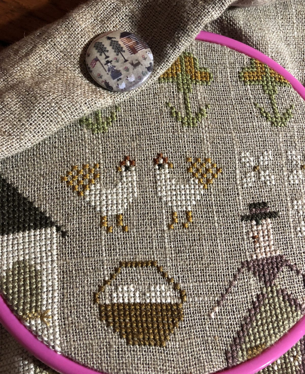
 Peace Be Upon Us. A favorite stitched sampler I stitched years ago framed in an old frame found at a favorite antique store in town that has now closed its doors.

Old, chippy and blue. My favorite combination!
 Even my stitcheries have to be coffee stained and left wrinkled to look right to me! Add a touch of Sweet Annie to smell good and add that drab touch of perfectness! The frame on the left holds the lyrics of a song called Fading Echoes written by my Great Grandma Houseal. A treasure for sure.
 A splash of color in the kitchen. But of course it’s sitting on a doily I stitched and stained for that beautiful prim goodness. These faux lemons smell wonderful! I do have a splash of color here and there!
I love to look at the prim things I see in stores, and online, but I can’t live with them. I tried adding them in to my home, but I am just cottage style. I like English and French Country styles too, and those suit me and my home very well!
I love to see variety and sometimes I see too many homes online that all have the same neutrals and some trendy items. So not me!
I love your home – it is so pretty and inviting. I’m like you in that I’ve tried different things in my home and just couldn’t live with them. Even though I like them in other people’s homes they’re just not me! And I definitely am not trendy!